Anyone who regularly watches boxing has probably picked up on an alarming trend of the past few years. I’m not talking about the Golden Boy/Top Rank rivalry or the disappearance of proper under cards from big fights. I’m talking about the most important aspect of promotion for a big fight: the name and the poster.
For the casual/non-fan, these posters act as windows into the boxing world; their job is to successfully get someone to shell out $59.99 on one fight (because let’s face it, you’re rarely going to get anymore than that). Boxing promoters are failing on almost every level to make these fights compelling through their misguided advertising efforts. Let’s take a look at some of the worst offenses of the last two years.
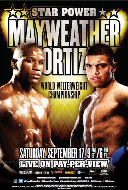
2011 – Floyd Mayweather vs Victor Ortiz: Star Power

This name reminds me of an old boss I used to have whose cat was named “Star Stuff.” I think it could also be a great name for the next season of Celebrity Apprentice, but it’s terrible for a fight. It just has no teeth to it at all, no suspense. It is softer than Chris Arreola’s soft spot for chicken wings and beer. In no way does it tell you what to expect from the fight at all. Floyd Mayweather is a star, surely one of the biggest in boxing right now, but is Ortiz even close? Even if Mayweather was in the ring with Pacquiao this would still make for a God-awful name. “Star Power” is just silly in any other context. Am I watching a boxing match or Laser Floyd at the planetarium next weekend? Or is this what my baby cousin wants for his Nintendo DS this Christmas? We’ll compromise and say it’s a gossip magazine run by the people that write Nintendo Power.
And is it just me, or does it look like these two are on the receiving end of golden showers?
2011 – Tomasz Adamek vs. Vitali Klitschko: Walka Walka

Possible Muppet influence aside, this poster is meant for Poland, but that is simply no excuse for its shittiness. Is this supposed to be for a boxing match or a guest appearance at a WWE event? They look like some backyard wrestling tag-team. Is this for some monster truck rally? And what is with the flames? Is this a shitty action flick about pyromaniacs/firefighters/pyromaniacs? Klitschko is legit engulfed in flames. Between the fire and the fact that he looks like a teddy bear, I’m 99% sure this is Poland’s version of a Smokey The Bear ad.
2011 – Waldimir Klitschko vs. David Haye: The Talk Ends Now
And yet the talk showed no signs of slowing down. It’s hard to give this poster a fair assessment with the disturbing images of Lennox Lewis dressed as an English driver and George Foreman missing his door opening cues still swimming in my mind from the pre-fight build up.
Anyone who saw this fight probably now has a completely different view of German television. Grammatically speaking, though “The Talk Ends Now” doesn’t make any sense. The “now” they refer to would either be when the writer wrote the copy or you read it. “The talk ends then” or “The talk ends soon” would make more logical sense and are only slightly less shitty. Luckily, they leave themselves an out by apparently burying the message behind a concrete wall. The talk apparently was supposed to end once someone found the sign. Thanks for solving the case, guys. Also, why on Earth does Klitschko have tiny cartoon baby hands?
2011 – Zab Judah vs. Amir Khan: Attack & Conquer

This name sounds like it could easily be a “Game of Thrones” episode or a lame history book about some airplane pilots in WWII. (Full disclosure: I Googled.) If the name of your fight easily doubles as the title of a dry history text, you are absolutely doing something wrong. I will give the Photoshop artist credit on this one for attempting to make Judah look as much like Bill Duke as possible. I love the text at the bottom right as well “The Best Fight Here.” It sounds so immediate and without any proper context; where is “here” in this statement, on the page? Why not go with the tried and true “Only The Best Fight Here” — was that just too sensible or trademarked? Or was that actually a placeholder the graphic designer forgot to replace later with the actual best fight? Maybe that’s why Khan looks so bored.
2010 – Mayweather vs Shane Mosley: Who R U Picking?

This poster wouldn’t be half bad if it weren’t for the moronic name overshadowing the rest of the poster. Boxing, I know you are a sport with an aging demographic continually losing new viewership to Four Loko and the UFC, but come on. You need to have some self-respect. I think I’m going to take back what I said about the rest of the poster looking all right because this just screams “Got Milk?” ad or grad school art show. I want to see some jacked dudes looking pissed, not some Dorothea Langue black and white portraiture. FAIL on all counts (get it?).
2010 – Mayweather vs Juan Manuel Marquez: I’m not even sure what the name is here.

I am seeing the number one. I am seeing the number one a total of five times on this poster. Is that the name of the fight, “One?” Or is it “Number One/Numero One?” Either way it’s a pretty bad name for a fight in which one fighter was quasi-retired fighter and the other drinks his own urine… Wait, maybe this was the perfect name for this fight despite it not even taking place in one weight class. I would like to give it credit for being multicultural blah, blah…. But I seriously cannot tell what the name of this fight even was from this poster. Also, did they really have to put tiny little Juan Manuel Marquez over his shoulder? Everyone knew he was out-sized by Mayweather by two divisions anyway. They should have called this “number two” because that is what we all ended up paying for anyways.
2010 – Manny Pacquaio vs. Joshua Clottey: The Event

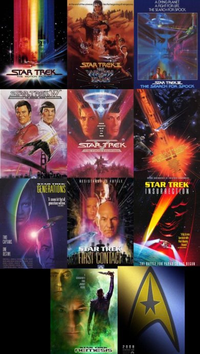
This literally looks like the combination of several Star Trek movie posters.

The non-descript energy field coupled with an M. Night Shyamalan-esque name like “The Event” sounded like the first mainstream merger of Sci-Fi and boxing. Sadly however, it wasn’t really anything in the end. The Event itself is actually a pretty presumptuous name for anything that isn’t “The God” or “The Bible.” Be careful with putting “The” in front of anything.
Author’s Note: I just remember that NBC launched some shitty sci-fi show of the same namesake about seven months after this fight; a mere coincidence? You be the judge.
2010 – Pacquaio vs Antonio Margarito: Untitled

This fight didn’t even get a name, just a blue smoke machine and horrifically retouched portraits of each fighter. Seriously, this poster is God-awful. It looks like something you would pick up at Spencer Gifts. I sincerely hope this was printed on black velvet — that’s the only way it could have been cosmically justified. That being said, this poster could also have been easily improved with the appearance of one wizard.
If it’s not clear to you by now that boxing has a seriously problem with promoting itself, you need to get your head examined. The fight poster used to be informative, smart and get you pumped up for a stellar event. Nowadays it just seems that flaccid material and lazy naming conventions have dominated even the biggest fights in boxing.
It might be true that great promotion is a thing of the past in boxing but that doesn’t mean that HBO/Showtime/etc. shouldn’t be working their hardest to improve these productions. This isn’t merely just an elitist jab at the boxing establishment; there is a serious point to be made as well. Boxing is struggling every day to remain relevant in the 21st century and piss-poor marketing and promotion (not to mention bad match-ups) are certainly not helping it to make a case for it’s continued existence.
With the way things are going I doubt that anything will change so I will simply be waiting for the next shitty poster to drop (I’m looking at you Pacqciuao vs. Marquez III).
Lakota Crofut is a contributing writer and editor at rudetudesports.com, a general humor sports blog.

